In my previous article, I explained how we started using Figma's Variables API to improve UI consistency at Domino's.
A key part of that solution was a custom design tokens package that I designed and developed to connect our Figma variables with our front-end applications. The package has since evolved, with further contributions from my team.
That article received a lot of interest, so in this tutorial, I'll show you how to build something similar yourself.
We'll fetch variables using Figma's REST API, resolve aliases, generate SCSS files supporting light and dark themes, and prepare the results for distribution as an npm package.
One caveat before we start: the Variables REST API currently requires a Figma Enterprise plan. If you don't have one, see What you'll need for alternatives.
Before we start
Why build your own design tokens package?
Plenty of tools already manage design tokens, and for many teams an existing solution is the right choice.
The main reason to build your own is control. You decide how variables are named, processed and organised, and which output formats you generate. That helps when you're working with existing applications that have specific requirements, and it gives you a clear understanding of how design decisions travel from Figma into production code.
The trade-off is maintenance: you'll need to keep the package compatible with changes to Figma's API and make sure the generated output stays reliable. If your requirements are fairly straightforward, a small Node.js application is often all you need.
What you'll need
- Figma Enterprise access. The Variables REST API requires an eligible Enterprise account, appropriate seat permissions and access to the relevant file. Check Figma's documentation for the latest requirements.
- Figma's personal access token with the
file_variables:readscope. - Node.js 24 or 26 LTS and npm. We'll use Node's built-in
fetchAPI, so there's no need for an additional HTTP client. - Basic JavaScript and SCSS knowledge.
If you're not on an Enterprise plan, Figma's Plugin API can read variables from inside Figma, although that needs a different implementation from the one in this article. Existing plugins and tools, such as Tokens Studio, may also cover your needs without any custom code.
1. Prepare your variables in Figma
Before writing any code, we need variables to work with.
Collections, modes and aliases
Figma organises variables using three concepts:
- Collections group related variables, such as colours or spacing.
- Modes let the same variable hold different values, such as Light and Dark.
- Aliases let one variable reference another instead of duplicating its value.
Our example uses two collections:
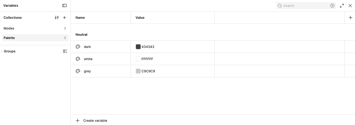
Paletteholds three base colours:Neutral/dark,Neutral/whiteandNeutral/grey. It has a single mode.Modesholds four semantic colours, includingSurface/primary,Text/primaryandBorder/default. It has two modes, Light and Dark, and each value is an alias pointing to a colour inPalette.
Both collections are included in the generated output in this sample project. You can also hide a palette collection from publishing if you only want semantic tokens in your package.
Palette:
Modes:
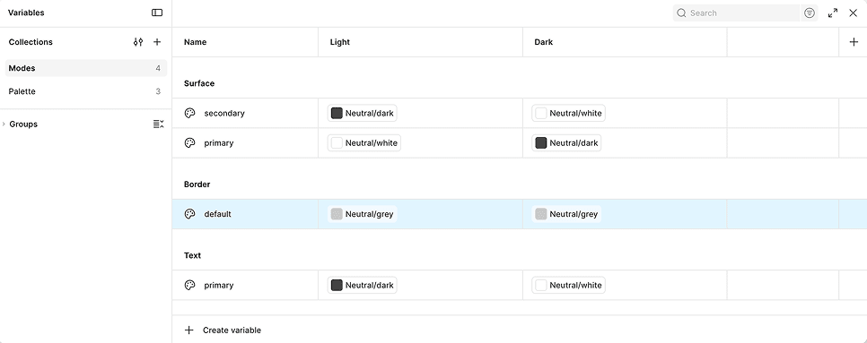
Aliases let designers maintain a colour palette separately from the semantic variables used throughout the interface. They also mean we can't copy values from the API response straight into CSS. We have to resolve those references first.
Choose meaningful variable names
Agree on a naming convention before you create your variables.
Text/primary describes how a colour is used, whereas Dark Grey describes how it looks. Semantic names are more flexible because their purpose stays the same even when the underlying values change.
Figma lets you use forward slashes to build hierarchies, and we'll use those names to generate CSS custom properties later:
Text/primary → --text-primary
2. Set up the Node.js application
The code in this tutorial is based on the package I originally developed for Domino's, with some refactoring and simplification to make the individual steps easier to understand.
We'll use Node.js to fetch the data, process the values and generate the output files.
Create a directory and initialise an npm package:
mkdir figma-design-tokens
cd figma-design-tokens
npm init -y
npm pkg set type=module
npm install --save-dev dotenv
We'll use JavaScript modules and Node's built-in fetch, so there's no need for an HTTP client. dotenv is a dev dependency because only the generation script needs it, not the consumers of your package.
Organise the application
You could write the whole process in one file, but smaller functions are easier to read and test. Here's the structure we'll build:
figma-design-tokens/
├── index.js
├── _config.js
├── _steps/
│   ├── _fetch-figma.js
│   ├── _write-json.js
│   ├── _alias-resolver.js
│   ├── _build-token-sets.js
│   └── _write-token-files.js
├── _utils/
│   ├── _files.js
│   ├── _names.js
│   └── _values.js
├── compiled/            # generated output
└── package.json
The process has four steps:
- Fetch variables from Figma.
- Save the response as JSON.
- Transform the variables into token sets: resolve aliases, convert values and sort.
- Write the SCSS and TypeScript files.
The application builds and validates the token sets before writing the generated SCSS and TypeScript files. This means errors during token transformation won't leave partially generated styles behind. We'll then write each completed token set to its corresponding output files.
// index.js
import { CONFIG } from "./_config.js";
import { fetchFigmaVariables } from "./_steps/_fetch-figma.js";
import { writeInitialJson } from "./_steps/_write-json.js";
import { buildTokenSets } from "./_steps/_build-token-sets.js";
import { writeTokenFiles } from "./_steps/_write-token-files.js";
try {
  const { FIGMA_FILE_KEY, OUTPUT_PATHS } = CONFIG;
  const data = await fetchFigmaVariables(FIGMA_FILE_KEY);
  writeInitialJson(data, OUTPUT_PATHS.JSON);
  const tokenSets = buildTokenSets(data);
  writeTokenFiles(tokenSets, OUTPUT_PATHS);
  console.log("Token compilation complete!");
} catch (error) {
  console.error("Token compilation failed:", error);
  process.exitCode = 1;
}
3. Fetch variables from Figma
Configure authentication
Store your token and file key in a .env file rather than hardcoding them:
FIGMA_API_TOKEN=your_access_token
FIGMA_FILE_KEY=your_figma_file_key
You can find the file key in the URL of the Figma file containing your variables. Add .env to .gitignore so your credentials aren't committed.
Then read the values and define your output paths in one place:
// _config.js
import "dotenv/config";
export const CONFIG = {
  FIGMA_FILE_KEY: process.env.FIGMA_FILE_KEY,
  OUTPUT_PATHS: {
    JSON: "./compiled/json/",
    SCSS: "./compiled/design-tokens/scss/",
    DOCS: "./compiled/helpers/doc-helpers/",
  },
};
Fetch the variables
Figma provides an endpoint for retrieving a file's variables:
GET /v1/files/:file_key/variables/local
// _steps/_fetch-figma.js
import "dotenv/config";
export async function fetchFigmaVariables(fileKey) {
  const token = process.env.FIGMA_API_TOKEN;
  if (!token || !fileKey) {
    throw new Error(
      "Set FIGMA_API_TOKEN and FIGMA_FILE_KEY in your .env file."
    );
  }
  const res = await fetch(
    `https://api.figma.com/v1/files/${fileKey}/variables/local`,
    { headers: { "X-FIGMA-TOKEN": token } }
  );
  if (!res.ok) {
    const body = await res.text();
    throw new Error(
      `Figma API request failed (${res.status}): ${body}`
    );
  }
  const { meta } = await res.json();
  return {
    collections: meta.variableCollections,
    variables: meta.variables,
  };
}
We include the status code and response body in the error because statusText is often empty. A 403 usually points to a missing token scope or insufficient plan or file access, and a 429 means you're being rate limited.
We only need two parts of the response:
variableCollections, which describes how variables are organised.variables, which contains the individual variable definitions and values.
Use the /local endpoint, because it provides the values for each collection mode. The /published endpoint serves a different purpose and doesn't provide the same per-mode values.
Understanding the API response
Here are shortened extracts from the two collections in my sample Figma project. I've omitted API metadata that isn't needed for this tutorial, but kept the actual IDs and mode names:
{
  "VariableCollectionId:1:2": {
    "id": "VariableCollectionId:1:2",
    "name": "Palette",
    "defaultModeId": "1:0",
    "hiddenFromPublishing": false,
    "modes": [{ "modeId": "1:0", "name": "Mode 1" }],
    "variableIds": ["VariableID:1:4", "VariableID:1:3", "VariableID:1:5"]
  },
  "VariableCollectionId:1:6": {
    "id": "VariableCollectionId:1:6",
    "name": "Modes",
    "defaultModeId": "1:1",
    "hiddenFromPublishing": false,
    "modes": [
      { "modeId": "1:1", "name": "Light" },
      { "modeId": "1:2", "name": "Dark" }
    ],
    "variableIds": [
      "VariableID:1:9", "VariableID:1:8",
      "VariableID:1:7", "VariableID:3:2"
    ]
  }
}
Each collection has a name, its modes, a default mode and the IDs of its variables. Each mode has an ID that we'll use when processing values.
In this sample, both collections have hiddenFromPublishing: false, so the generator will export files for both. If you hide a collection in Figma, the generator skips its output but can still use its variables to resolve aliases.
Now let's look at Surface/primary, a semantic variable in the Modes collection:
{
  "VariableID:1:8": {
    "id": "VariableID:1:8",
    "name": "Surface/primary",
    "variableCollectionId": "VariableCollectionId:1:6",
    "resolvedType": "COLOR",
    "valuesByMode": {
      "1:1": { "type": "VARIABLE_ALIAS", "id": "VariableID:1:3" },
      "1:2": { "type": "VARIABLE_ALIAS", "id": "VariableID:1:4" }
    }
  }
}
This variable doesn't contain actual colour values. Instead, Light mode references Neutral/white, while Dark mode references Neutral/dark. Those palette variables hold direct colours:
{
  "VariableID:1:3": {
    "id": "VariableID:1:3",
    "name": "Neutral/white",
    "variableCollectionId": "VariableCollectionId:1:2",
    "resolvedType": "COLOR",
    "valuesByMode": {
      "1:0": { "r": 1, "g": 1, "b": 1, "a": 1 }
    }
  },
  "VariableID:1:4": {
    "id": "VariableID:1:4",
    "name": "Neutral/dark",
    "variableCollectionId": "VariableCollectionId:1:2",
    "resolvedType": "COLOR",
    "valuesByMode": {
      "1:0": { "r": 0.26340895891189575, "g": 0.26340895891189575, "b": 0.26340895891189575, "a": 1 }
    }
  }
}
These are concrete colours, but their channels still need to be converted to CSS values. Notice that mode IDs belong to their collections: Modes uses 1:1 and 1:2, while Palette uses 1:0. We'll handle those differences when resolving aliases.
Save the retrieved data
Before transforming anything, save the response as JSON:
// _steps/_write-json.js
import { writeFile } from "../_utils/_files.js";
export function writeInitialJson({ collections, variables }, jsonPath) {
  writeFile(
    `${jsonPath}collections.json`,
    JSON.stringify(collections, null, 2)
  );
  writeFile(
    `${jsonPath}variables.json`,
    JSON.stringify(variables, null, 2)
  );
}
// _utils/_files.js
import fs from "fs";
import path from "path";
export function writeFile(filePath, contents) {
  fs.mkdirSync(path.dirname(filePath), { recursive: true });
  fs.writeFileSync(filePath, contents);
}
This snapshot lets you debug the generation process without repeatedly calling Figma, and it's still there if a later step fails. These JSON files are intermediate build files and aren't published with the package.
4. Transform Figma variables into design tokens
This is the core of our application. Figma gives us structured design data, but our applications need usable CSS values. We'll convert variable names, resolve aliases, match modes and generate two types of output: SCSS mixins containing CSS custom properties, and TypeScript files containing token metadata for documentation.
Convert Figma names into CSS names
Figma variable names can contain slashes, spaces and other characters, so we need a consistent way to turn them into CSS-safe names:
// _utils/_names.js
export function buildName(value) {
  if (!value) return;
  return String(value)
    .toLowerCase()
    .replace(/[^a-z0-9]+/g, "-")
    .replace(/^-+|-+$/g, "");
}
| Figma name | CSS property |
|---|---|
Text/primary | --text-primary |
Border/default | --border-default |
Surface/secondary | --surface-secondary |
The helper returns the lowercase, hyphenated name, and we add the -- prefix when we write the declaration. We also use it for collection filenames and mode suffixes.
Because the helper lowercases everything, two different Figma names such as Text/Primary and Text/primary would produce the same property. We'll check for that when we build the token sets.
If your team already maintains a web code syntax on each variable in Figma, you can read variable.codeSyntax.WEB instead of generating names. You'll just need to parse it if it contains var(...).
Resolve variable aliases
Remember Surface/primary? Its values are references to other variables, not colours. In Light mode (1:1), it points to Neutral/white; in Dark mode (1:2), it points to Neutral/dark. Both palette variables belong to a collection with just one mode (1:0). When an alias crosses collections, we have to select the right mode in the target collection.
The resolver below tries these options in order:
- The same mode ID, which works for aliases within a collection.
- A mode with the same name, such as Light to Light.
- The target collection's
defaultModeId, which suits single-mode collections like our palette.
// _steps/_alias-resolver.js
export class AliasResolver {
  constructor(variables, collections) {
    // Include every variable, even those in hidden collections
    this.variables = new Map(
      Object.values(variables).map(v => [v.id, v])
    );
    this.collections = collections;
  }

  resolve(variable, modeId) {
    const collection = this.collections[variable.variableCollectionId];
    const modeName = collection.modes.find(
      m => m.modeId === modeId
    )?.name;
    return this.#follow(
      variable.valuesByMode[modeId],
      modeId,
      modeName,
      new Set([variable.id])
    );
  }

  #follow(value, modeId, modeName, seen) {
    if (value?.type !== "VARIABLE_ALIAS") return value;
    if (seen.has(value.id)) {
      throw new Error(`Circular alias: ${value.id}`);
    }
    seen.add(value.id);
    const target = this.variables.get(value.id);
    if (!target) {
      throw new Error(`Unresolved alias: ${value.id}`);
    }
    const targetModeId = this.#matchMode(target, modeId, modeName);
    return this.#follow(
      target.valuesByMode[targetModeId],
      targetModeId,
      modeName,
      seen
    );
  }

  #matchMode(variable, modeId, modeName) {
    if (modeId in variable.valuesByMode) return modeId;
    const collection = this.collections[variable.variableCollectionId];
    const sameName = collection.modes.find(m => m.name === modeName);
    return sameName?.modeId ?? collection.defaultModeId;
  }
}
In our sample, the resolver follows Surface/primary in Light mode (1:1) to Neutral/white, then uses the palette collection’s default mode (1:0) to obtain the actual colour. Dark mode follows the same process to Neutral/dark. The resolver also throws on missing or circular alias references, so those errors fail the run rather than producing bad tokens.
Why flatten aliases?
We resolve aliases all the way down to concrete values, so the generated Light and Dark mixins are self-contained. The sample also exports the Palette collection, but the semantic tokens don't depend on its generated CSS because their aliases have already been flattened.
An alternative is to preserve the alias relationships in the generated CSS, for example by emitting var(--neutral-white) instead of its resolved colour. That approach requires applications to include the palette declarations as well as the semantic ones. Choose whichever suits your design system.
Convert values into CSS
Once aliases are resolved, we convert the underlying values into CSS. Our implementation handles three variable types: COLOR, FLOAT and STRING. Any other type, such as BOOLEAN, is skipped with a warning so it never disappears silently.
// _utils/_values.js
export function buildToken(type, value) {
  if (value === undefined || value === null || value === "") return;

  switch (type) {
    case "COLOR":
      return buildRgba(value);
    case "FLOAT":
      return buildSizeUnit(value);
    case "STRING":
      return String(value);
    default:
      console.warn(`Skipping unsupported variable type: ${type}`);
  }
}

function buildRgba({ r, g, b, a }) {
  const alpha = Math.round((a + Number.EPSILON) * 100) / 100;
  return `rgba(${Math.round(r * 255)}, ${Math.round(g * 255)}, ${Math.round(b * 255)}, ${alpha})`;
}

function buildSizeUnit(value) {
  return `${value}px`;
}
Colours. Figma returns channels as numbers between 0 and 1, so we multiply red, green and blue by 255. Our white { r: 1, g: 1, b: 1, a: 1 } becomes rgba(255, 255, 255, 1).
Numbers. FLOAT values become pixel values, so 16 becomes 16px. That suits spacing, but not every number should have a unit. If you use numeric variables for opacity, line height or other unitless properties, extend this converter.
Strings. Strings are returned as they are, which works when the string is already a valid CSS value. Values that need specific syntax or quoting need extra formatting.
Each variable type has its own converter, so the application is easy to extend.
Build the token sets
Now we combine everything. For each collection, we create one token set per mode, or a single set if the collection has only one mode. The generator skips collections marked hiddenFromPublishing; in our sample, both collections are included.
Each variable's collection is available as variable.variableCollectionId, and the loop already knows the collection and mode it's working on, so there's no need to search for the right mode.
// _steps/_build-token-sets.js
import { AliasResolver } from "./_alias-resolver.js";
import { buildName } from "../_utils/_names.js";
import { buildToken } from "../_utils/_values.js";

export function buildTokenSets({ collections, variables }) {
  const resolver = new AliasResolver(variables, collections);
  const tokenSets = new Map();
  for (const collection of Object.values(collections)) {
    if (collection.hiddenFromPublishing) continue;
    const hasMultipleModes = collection.modes.length > 1;
    for (const mode of collection.modes) {
      const collectionName = buildName(collection.name);
      const key = hasMultipleModes
        ? `${collectionName}--${buildName(mode.name)}`
        : collectionName;
      const tokens = new Map();
      for (const id of collection.variableIds) {
        const variable = variables[id];
        const resolved = resolver.resolve(variable, mode.modeId);
        const value = buildToken(variable.resolvedType, resolved);
        if (value === undefined) continue;
        const name = `--${buildName(variable.name)}`;
        if (tokens.has(name)) {
          throw new Error(
            `Name collision in "${collection.name}": ${name}`
          );
        }
        tokens.set(name, value);
      }
      tokenSets.set(key, {
        title: hasMultipleModes ? mode.name : collection.name,
        tokens: sortTokens(tokens),
      });
    }
  }
  return tokenSets;
}

function sortTokens(tokens) {
  const entries = [...tokens];
  const allPixels = entries.every(([, value]) =>
    /^-?\d+(\.\d+)?px$/.test(value)
  );
  return entries.sort(([nameA, valueA], [nameB, valueB]) =>
    allPixels
      ? parseFloat(valueA) - parseFloat(valueB)
      : nameA.localeCompare(nameB)
  );
}
A few things are worth noting:
- The key for each set doubles as the filename and mixin name. A collection called
Modeswith Light and Dark modes producesmodes--lightandmodes--dark, while a single-mode collection calledSpacingproducesspacing. - Tokens are sorted alphabetically to keep the output predictable and easy to review. When every value in a set is a pixel value, they're sorted numerically instead, so
4px,8px,12pxand16pxread in order. - The name collision check throws an error rather than letting one token silently overwrite another.
Write the files
Finally, we render each token set as an SCSS mixin and a TypeScript file:
// _steps/_write-token-files.js
import fs from "fs";
import { writeFile } from "../_utils/_files.js";

export function writeTokenFiles(tokenSets, paths) {
  // Remove stale files from renamed or deleted collections
  fs.rmSync(paths.SCSS, { recursive: true, force: true });
  fs.rmSync(paths.DOCS, { recursive: true, force: true });
  for (const [key, { title, tokens }] of tokenSets) {
    const declarations = tokens
      .map(([name, value]) => `  ${name}: ${value};`)
      .join("\n");
    writeFile(
      `${paths.SCSS}collection-${key}--css-vars.scss`,
      `@mixin ${key}--css-vars {\n${declarations}\n}\n`
    );
    const variables = tokens.map(([name, value]) => ({ name, value }));
    writeFile(
      `${paths.DOCS}${key}.ts`,
      `export default [{\n  title: ${JSON.stringify(title)},\n  variables: ${JSON.stringify(variables, null, 2)}\n}];\n`
    );
  }
}
Each token set is rendered into a complete file rather than assembled through multiple append operations. This keeps the generation process straightforward and makes the resulting files easier to inspect and review.
For our sample, the generator produces three SCSS files: collection-palette--css-vars.scss, collection-modes--light--css-vars.scss and collection-modes--dark--css-vars.scss. It also creates a corresponding TypeScript documentation file for each token set.
The generated SCSS
Here's the Light mode file generated from the sample variables:
@mixin modes--light--css-vars {
  --border-default: rgba(201, 201, 201, 1);
  --surface-primary: rgba(255, 255, 255, 1);
  --surface-secondary: rgba(67, 67, 67, 1);
  --text-primary: rgba(67, 67, 67, 1);
}
And the Dark mode file:
@mixin modes--dark--css-vars {
  --border-default: rgba(201, 201, 201, 1);
  --surface-primary: rgba(67, 67, 67, 1);
  --surface-secondary: rgba(255, 255, 255, 1);
  --text-primary: rgba(255, 255, 255, 1);
}
The property names are identical in both modes, while the values can differ. Here, Surface/primary, Surface/secondary and Text/primary change between themes, but Border/default remains the same because both modes reference Neutral/grey. UI components can use the same custom properties regardless of the active theme.
The generator also creates a single-mode palette mixin. Our component examples use the semantic mixins, so they don't need to include the palette mixin separately.
The generated TypeScript
The TypeScript files aren't needed for styling. They provide a structured list of tokens and values that documentation tools can consume, so you get two outputs from the same Figma data without maintaining them separately:
export default [{
  title: "Light",
  variables: [
    { name: "--border-default", value: "rgba(201, 201, 201, 1)" },
    { name: "--surface-primary", value: "rgba(255, 255, 255, 1)" },
    { name: "--surface-secondary", value: "rgba(67, 67, 67, 1)" },
    { name: "--text-primary", value: "rgba(67, 67, 67, 1)" }
  ]
}];
5. Package and distribute the design tokens
To make the tokens available to multiple applications without copying files between codebases, publish them as an npm package.
Configure package.json
{
  "name": "@your-scope/design-tokens",
  "version": "1.0.0",
  "type": "module",
  "scripts": {
    "fetch:design-tokens": "node ./index.js"
  },
  "files": [
    "./compiled/design-tokens/",
    "./compiled/helpers/doc-helpers/"
  ]
}
The files array determines which directories are included in the published package: the generated SCSS files and the TypeScript documentation helpers. The intermediate JSON files are left out because consumers don't need them.
Generate and verify the package
Run the token generation process:
npm run fetch:design-tokens
Then check what would be included in the published package:
npm pack --dry-run
This catches missing files and unexpected contents before you publish.
Once you've verified the package contents, it's ready to publish to your chosen npm registry. For a public scoped package, you can use npm publish --access public, provided you've configured the package name and npm authentication. For private registries, follow your organisation's publishing process.
6. Use the design tokens in a front-end application
Once the package is published, install it in your front-end project using npm install @your-scope/design-tokens.
Then import the SCSS files in your main stylesheet:
@use "@your-scope/design-tokens/compiled/design-tokens/scss/collection-modes--light--css-vars.scss" as *;
@use "@your-scope/design-tokens/compiled/design-tokens/scss/collection-modes--dark--css-vars.scss" as *;
Depending on your bundler, you may need to add node_modules to Sass's load path for these imports to resolve.
Apply light and dark themes
The generated files contain SCSS mixins, so importing them doesn't output any CSS. We need to include the mixins in the right selectors:
:root {
  color-scheme: light;
  @include modes--light--css-vars;
}
// Respect the system setting unless the user has chosen light
@media (prefers-color-scheme: dark) {
  :root:not([data-theme="light"]) {
    color-scheme: dark;
    @include modes--dark--css-vars;
  }
}
// An explicit choice always wins
html[data-theme="dark"] {
  color-scheme: dark;
  @include modes--dark--css-vars;
}
:root sets the default Light values. When the user's system prefers a dark theme, and they haven't explicitly chosen Light, the first dark rule overrides them. The data-theme="dark" attribute lets an application force dark mode regardless of the system setting, and it works because that selector has higher specificity than :root.
Setting color-scheme is a small but valuable detail, because it makes native controls and scrollbars follow the theme.
The application only needs to set the data-theme attribute on the HTML element. To avoid a flash of the wrong theme, set it in an inline script in the <head>, before the page renders:
<script>
  const saved = localStorage.getItem("theme");
  if (saved) document.documentElement.dataset.theme = saved;
</script>
Use tokens in components
Components can then reference the custom properties directly:
.card {
  background-color: var(--surface-primary);
  color: var(--text-primary);
  border: 1px solid var(--border-default);
}
The component doesn't need separate rules for each theme. It uses the same semantic variables every time, and the active theme determines their values.
That separation is especially useful in a shared component library, where components are consumed by multiple applications. They don't need to know where the values came from or how the theme was selected.
7. Keep your design tokens up to date
When variables change in Figma, rerun the compilation process to regenerate the token files. Before publishing an updated package, put a few safeguards in place.
Review generated changes
Changing a colour updates its generated CSS value, but that change can affect many components. Renaming or removing a variable is more disruptive because it can break applications that depend on it.
The generator already fails on API errors, missing or circular aliases and name collisions, and it warns about unsupported variable types. These checks help catch technical errors, but they can't tell you whether a token's value is visually appropriate. So I recommend committing the generated files and reviewing the changes in a pull request, paying particular attention to removed or renamed custom properties.
At Domino's, we have hundreds of tokens, so checking the visual impact of every change by hand isn't realistic. We use Chromatic as a visual regression gate for our Shared UI component library. When we update the tokens package in Shared UI, Chromatic compares the rendered component snapshots against their previous versions and highlights differences for review. This helps us catch unexpected visual changes before releasing the updated component library to consuming applications.
Chromatic's coverage is limited to the components and states represented in our Storybook stories, so it complements reviewing generated files and testing in real applications rather than replacing them.
Version your package
Use semantic versioning to communicate the impact of changes. Updates to existing token values may be suitable for patch or minor releases, depending on their impact. Removing or renaming a token is a breaking change. Renaming a collection or mode in Figma can also be breaking, as it changes the generated filenames and mixin names.
Document each release so consumers know what to expect.
Consider automation
The next step is running the process in CI/CD so that generation, checks and publishing follow a repeatable path. A few practical points:
- Store the Figma token as a CI secret. Personal access tokens can expire, so plan how you'll rotate it.
- Figma's
LIBRARY_PUBLISHwebhook can notify you when a library is published, potentially triggering token generation. If you automate this, account for the possibility of receiving multiple events for a single publication. - Decide whether to publish automatically or after an approval step. The review described above is a natural place for one.
Conclusion
We've built a reusable design tokens package using Figma's Variables API and Node.js. It retrieves variables, organises them by collection and mode, resolves aliases, converts values into CSS custom properties, generates documentation data and prepares the resulting files for distribution through npm.
When I originally built this package for Domino's, my goal was to remove the inconsistencies between design decisions and the values used in our applications. It has since become a reusable part of our UI development infrastructure, and it continues to evolve with contributions from my team.
The biggest benefit isn't just avoiding manual copying and pasting. It's having a repeatable way to keep design values and front-end implementations aligned.
Start with a few variables, get the process working from Figma to CSS, and expand it as your requirements grow.
