When you work on one product, UI decisions can feel very local. A component is changed, a page is updated, a pattern is adjusted in a single repository, and the impact is mostly contained.
When you work across multiple products sharing the same UI, the same decision becomes part of a system.
A small change to a shared component can affect several applications. A CSS decision can impact experimentation. A missing accessibility expectation can be repeated across multiple journeys. A design token can become the difference between consistent theming and dozens of slightly different colours living across different codebases.
That is the part of UI work I have become increasingly interested in: not just building individual interfaces, but building the foundations that help many teams create better interfaces with more consistency and confidence.
In my current role as a UI Development Team Lead at Domino’s UK & Ireland, I work across shared UI libraries, design systems, accessibility, Storybook documentation, visual regression testing, design tokens, and frontend delivery processes. Over time, I have realised that the most valuable UI work is often not the most visible work. It is the work that quietly improves how other teams build.
This article is a reflection on what I have learned from building and supporting UI foundations across multiple web applications at Domino's.
When UI Decisions Stop Being Local
In a single product team, a UI decision usually belongs to that product. I should know that, since I have worked on many individual products during my career.
In a multi-product environment, those decisions quickly become bigger than one team.
If five applications use the same shared UI library, then every component has to support more than one immediate use case. It needs to be flexible enough to work across different journeys, but not so flexible that it becomes inconsistent or difficult to maintain.
I have seen this most clearly with components like product cards and buttons, where a small implementation detail to one variant of a component can affect layout, accessibility and even A/B tests of others.
That balance is difficult.
Too much control, and teams feel blocked by the system. Too much flexibility, and the system stops being a system. Components become configurable to the point where every product can make them behave differently, and consistency slowly disappears.
This is where UI foundation work becomes more than frontend implementation. It becomes product and design thinking, engineering judgement, and communication all at once.
A shared component is not just a piece of code. It is a decision that other teams inherit.
That means every API, prop, slot, class name, token, accessibility behaviour, and documentation example matters more than it might seem at first.
The Quiet Cost of Inconsistency
Inconsistency rarely appears all at once. It usually grows quietly.
One team adds a slightly different spacing rule. Another team creates a one-off variation of a component because the shared version does not quite support their use case. A designer introduces a new pattern in Figma, but there is no clear path for turning it into a reusable component. A developer fixes an accessibility issue locally, but the learning never makes it back into the shared library.
None of these things feel dramatic in isolation. In fact, they are often reasonable decisions in the moment. Teams are just trying to deliver on time. They have deadlines. They need to solve the problem in front of them.
But over time, the cost becomes visible.
The same UI problem gets solved multiple times. Design and code drift apart. QA has to learn different behaviours for similar patterns. Accessibility becomes inconsistent, and product teams lose confidence in the shared library. Designers are not always sure which patterns are available, just like developers are not always sure which components are safe to use.
This is one of the biggest reasons UI foundations matter.
Good UI foundations do not remove all complexity, but they reduce unnecessary complexity. They give teams a shared starting point and make the right thing easier to do. They help teams spend less time recreating basic patterns and more time solving the specific problems that matter to users.
For me, this is where design systems become truly valuable. Not as a polished collection of components, but as a way of reducing repeated decision-making across teams.
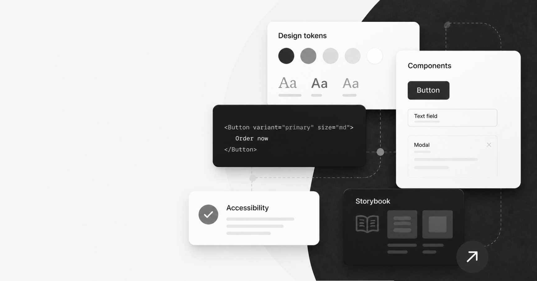
What I Mean by UI Foundations
When people hear “shared UI”, they often think about component libraries first. That is understandable. Components are the most visible part of the system.
But UI foundations are much broader than that.
To me, UI foundations include:
- Reusable components and patterns
- Design tokens
- CSS architecture
- Accessibility standards
- Storybook documentation
- Visual regression testing
- Release notes and migration guidance
- Package publishing processes
- Setting consumer responsibilities
- Cross-product validation
- And in general - the relationship between design, engineering, QA, and product teams
A component library is the code. UI foundations are the system around the code.
For example, a button component is useful. But a button component with clear usage guidance, accessible focus states, design token support, visual regression coverage, documented variants, and a reliable release process is much more valuable.
The same applies to larger patterns. A modal is not just a container that opens and closes. It needs to handle focus management, keyboard behaviour, scroll and close behaviour, content structure, responsive layouts, accessibility announcements, and edge cases. If those expectations are not defined, every consuming team has to interpret them for themselves.
That is where inconsistency comes back in.
Good UI foundations create shared expectations. They answer questions before every team has to ask them again.
A Component Library Is Only One Part of the System
One of the biggest lessons I have learned is that having a component library does not automatically mean you have a strong UI platform.
A component library can exist and still be difficult to use.
It can have components that are technically reusable, but poorly documented. It can also have components that have too many props because they have absorbed years of one-off requirements. Components in the library can look visually correct, but not clearly define keyboard or screen reader behaviour. The new versions of the library can be published regularly, but without enough guidance for consuming teams to understand what changed or what they need to test.
This is why I think the work around the component is just as important as the component itself.
- Can teams find the component and understand when to use it?
- Can they see examples that match real product use cases?
- Can QA understand the expected behaviour?
- Can designers see whether the implementation matches the intended pattern?
- Can accessibility expectations be tested?
- Can teams upgrade safely?
If the answers to those questions are unclear, the component library will struggle to scale.
We use Storybook to develop components in isolation at Domino's, and I have found it useful to think about Storybook as a platform to serve several audiences at once: developers need implementation details, QA needs expected behaviours, UX needs confidence that the component reflects the design intent, and product teams need to understand the impact of changes. And when it comes to the release notes, they became a way of communicating impact.
This means Storybook becomes more than just a development tool. It becomes a shared space for documentation, review, and quality.
This is the difference between building components and building a UI platform.
Building for Adoption, Not Just Reuse
It is easy to say that shared components or design tokens should be reused. It is much harder to make reuse feel natural.
Adoption does not happen just because a component exists. Teams adopt shared UI when it solves their problem, is easy to understand, and does not create more friction than it removes.
That means a lot of UI platform work is really about reducing friction.
Clear examples matter. Naming matters. So do defaults, documentation, migration notes and release processes. The ability to listen when consuming teams struggle with a pattern could make or break the adoption of the UI library.
A technically good component can still fail if teams do not trust it, understand it, or know how to integrate it.
This is especially true when a shared library is used across multiple applications. A change cannot only be tested in isolation. It needs to be validated in the places where it is actually consumed. A component might look perfect in Storybook but behave differently inside a real product layout, with real content, data, and real edge cases.
This is why I care about the full path from component to production.
Often, our acceptance criteria explicitly includes updating consuming applications with the new shared package version and validating the change across products, because the shared library work is not truly complete until it has been tested, where users would experience it.
For shared UI work to succeed, teams need more than a package version. They need context. They need to know what changed, why it changed, whether it affects them, and what they need to check.
That is not admin. That is part of the product experience of the design system itself.
Accessibility Has to Be Part of the Foundation
Accessibility is often treated as something that happens at the end of a piece of work. A final check. A QA task. A list of issues to fix before release.
In shared UI work, that approach does not go far enough.
If a component is used across several products, its accessibility behaviour is also reused across several products. That can be a very good thing if the component is built well. It can also be a risk if the pattern is unclear, incomplete, or easy to misuse.
Accessibility has to be part of the foundation.
That means defining keyboard behaviour. It means thinking about focus management when a component opens, closes, updates, or disappears. It means making sure hidden content is actually hidden from keyboard users and assistive technologies. It means documenting what screen readers should announce and what should stay silent. It also means being clear about what the consuming team is responsible for.
A shared component can provide accessible defaults, but it cannot always guarantee an accessible page.
For example, an accordion component can manage expanded and collapsed states correctly, but the consuming team still needs to provide meaningful content and use it in the right context. A modal can manage focus, but the journey around it still needs to make sense. A skip link can exist in the header, but the page still needs a valid target.
This is why accessibility documentation matters so much.
For each important component, I like to think about accessibility in practical terms:
- What is the purpose of this component?
- How should keyboard users interact with it?
- Where should the focus move?
- What should a screen reader announce?
- What should remain hidden?
- What must consuming teams do correctly?
When these expectations are written down, accessibility becomes less subjective. It becomes easier for developers to build, for QA to test, and for designers to consider earlier in the process.
A simple example is an accordion. Visually, collapsed content may look hidden, but if interactive elements inside it can still receive keyboard focus, the experience becomes confusing and inaccessible. That kind of issue needs to be solved at the component level, then documented so teams know what behaviour to expect.
The Invisible Work That Keeps UI Systems Healthy
Some of the most important UI platform work is work that most people never see.
Cleaning up package publishing. Removing files that should never have been shipped to consumers. Aligning dependency versions. Maintaining Storybook. Reviewing visual regression snapshots. Improving CSS architecture. Writing migration notes. Removing unused props. Creating release templates. Checking that external tools and third-party integrations are not broken by internal implementation details.
This work is not always glamorous, but it is what keeps a UI system healthy.
One example from my own work was improving the way our shared UI package was published. Over time, the package had started to include files that consumers did not need, such as stories, tests, documentation, and internal assets. Cleaning that up significantly reduced the package size (from roughly 20MB to 2MB) and made the library more focused for consuming applications. It was not a flashy UI change, but it made the package cleaner, lighter, and more appropriate for production consumers.
That kind of work does not change the visual design of a page, but it improves the foundation that every consuming application relies on.
Another example is CSS architecture. In one area, we had to think carefully about scoped styles and dynamic selectors. Scoped styles can be useful, but in our context, dynamically generated attributes created problems for external experimentation tools that relied on stable selectors. The solution was not just a technical preference. It was a platform decision: stable, predictable class names mattered because other teams and tools depended on them.
These are the kinds of details that often sit below the surface of UI work. They are easy to miss until something breaks.
A healthy UI system needs people who care about those details before they become production issues.
What I’ve Learned
The more I work in this space, the more I believe that shared UI work needs clear ownership.
Not ownership in the sense of controlling everything, but ownership in the sense of caring for the system as a whole. Someone needs to think about how the component library evolves, how design decisions become code, how accessibility is documented, how teams consume releases, how visual quality is protected, and how technical debt is managed before it slows everyone down.
A few lessons stand out.
First, consistency does not happen by accident. It needs shared patterns, clear documentation, and regular maintenance.
Second, documentation is part of the product. If teams cannot understand how to use a component, the component is not finished.
Third, accessibility needs to be designed into the system, not added as a final layer.
Fourth, adoption matters as much as implementation. The best component is not the one with the most options. It is the one that helps teams do the right thing with the least confusion.
Fifth, UI foundations are never really done. Products change. Design language evolves. Frameworks move on. Accessibility expectations mature. What matters is having a system that can evolve without becoming chaotic.
And finally, the invisible work matters. The package cleanup, the release notes, the testing setup, the design token naming, the migration guidance, the small fixes to focus states and CSS selectors — all of it contributes to the quality of the user experience, even when users never see the work directly.
Over time, my role has moved from simply building UI to thinking about the conditions that help other teams build good UI. That shift has changed the way I see frontend work. The craft is still important, but so is the system that allows that craft to scale.
Why This Work Matters
The goal of UI foundations is not to make every product look identical.
The goal is to give teams a stronger starting point.
Good UI foundations help teams move faster without creating unnecessary inconsistency. They make design intent easier to carry into production. They reduce repeated work. They make accessibility easier to implement correctly and give QA clearer expectations. They help developers focus on product problems instead of rebuilding the same patterns again and again.
Most importantly, they create a better experience for users.
Users do not see the component library. They do not see the design tokens, Storybook pages, release notes, visual regression tests, or packaging improvements. But they feel the result when journeys are more consistent, interactions behave as expected, pages are easier to navigate, and products feel more considered.
That is why I care about this work.
For me, building UI foundations across multiple products is about more than maintaining components. It is about creating the conditions for better digital experiences to happen consistently, at scale, and with less friction for everyone involved.