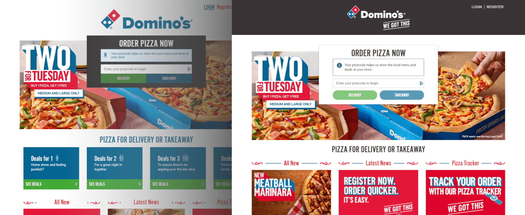
Some time ago, just before the Corona situation pushed us all into our caves (a.k.a Love/Hate Working From Home), the team and I started planning a reskin project for UK Domino’s website.
What is a reskin, you ask? Simply put – a reskin is a user interface (know as UI) refresh of the client-facing side of the website.
The process goes something like this:
- You get an x (8, in our case) years old website as a starting point.
- You get a very fancy and polished wished-for result in a design format.
- You try to transition from one to another in the smoothest-possible way without shocking your daily visitors and thus negatively affecting the business’s revenue.
The last point is the problem, you see. Domino’s in the UK is one of the most popular pizza makers/bakers/and deliverers. When thousands of daily visitors know and trust the current website, the tiniest change in UI can significantly affect their behaviour.
Green filled CTA turned hollow? Oops, 5% of visitors stopped clicking on it! Which results in money lost. Which results in the release rollback. Which results in time wasted. Nobody wants that.
I am using my cheerful voice when writing this, but things could not be more serious. Having spent months in the planning and even more months in coding, I can assure you that the reskinning of the legacy website is a complicated business.
Considerations
We have a couple of issues here:
- We will be working on a living project, which means that other dev teams will also be actively working on it. Implementing new features, changing UI, adding backend logic, all that good stuff.
- The wished-for result in some places is drastically different, which means HTML changes will also be required.
- The project uses outdated technologies and practices, which means layouts are built using CSS tables, floats and absolute positioning. And nearly every UI element has a fixed width assigned to it. This means that simple changes such as making the page container wider will require every child element’s update too! Yikes.
- Since the codebase is quite old, the UI components (somewhat new term) are non-existent, which means that in some cases, we have 100s of instances of copy-pasted code for the same UI elements all over the codebase. This means that every time the HTML update is needed, a typically 5 min job has the potential to become a very laborious piece of work which is nearly impossible to estimate at a quick glance.
Does this sound complicated yet?
The question you might now have is possibly this – why do it at all? Just rebuild the website using all the modern practices, technologies, UI components, etc. This would certainly be easier! Mais oui oui, my friend, remember what I said earlier? Domino’s is a brand with a massive fan base. When people see a staggering change in the app or website they got used to seeing in a particular way, that change can potentially affect their trust in the platform. In the age of phishing and never-ending online scams, maintaining your customer’s trust is more important than ever. And let me tell you a little secret – a new website is coming. The main point of the reskin project was to create a bridge between old and new.
The process
Let me be honest here – I have never done a reskin project of such scale before. Domino’s, by far, has the most extensive number of daily visitors I ever had to code for. In fact, none of the devs working on this project did. The only people who had some reskinning experience while working in other companies were our digital delivery manager Paul (he left since) and our UX lead Nicola. This was going to be a good learning experience for most of us.
The approach we decided to take was – to go slow and incremental.
To begin with, there would be a small team of 1 product owner, 1 designer and 2 devs working on this project. QA team will join later.
We would split the work into 5 phases, where each phase will address one or a few related areas of UI. For example, in one phase, we could handle all colours. In the next phase – rounding the cards and buttons.
The idea was that releasing the changes incrementally would allow us to gradually introduce a new look to our customers and prevent them from experiencing otherwise a pretty big difference shock.
Phase 1 – test the ground
This phase was a key to discovering what our legacy system is all about. In phase 1, we checked the codebase, updated the outdated NPM packages, created a file system for all the future phases, and introduced one minor client-facing change – primary and secondary colour updates. The change was so small, in fact, that it went completely unnoticed! And that was fine because the main objective was to learn what beast we were dealing with and what to look out for in the future stages.
Release date – 10/2020
Phase 2 – bring on the light
If you had ever visited Domino’s website before we released the second phase, you would have noticed a lot of dark shades – grey navigation, black menu cards, and navy used for backgrounds in multiple places.
What we did in this phase was to lighten the website up. A lot of elements went bright. We introduced the shadows for cards to create a separation from the background. Also, we started working on alignment and spacing issues which could be seen all over the website. A sort of nightmare for a perfectionist like me, if you ask.
UI elements which were crammed before were given more breathing space. We replaced some PNG icons with vectors. The website started taking a nice shape.
From the user perspective, not that many things changed, but if you looked closer, you could see that pages just looked… cleaner. Elements were aligned, icons – were sharper, pages – brighter. This phase was a big one for us devs, and with it, we started seeing a very positive change.
Release date – 02/2021
Phase 3 – more groundwork
After phase 2 was completed, we realised that our phases were somewhat large. We initially wanted smaller, more incremental releases, which did not happen with Phase 2. As a result, we started looking into how to make our phases smaller. However, this was hard to achieve from the design perspective, as many elements depended on each other’s appearance.
For example – if I swap the icon in the allergen key, the spacing between allergens also needs to be changed. If I adjust the spacing between allergens, the spacing between the allergens container and its surrounding elements is also affected. If I modify this spacing, I have to check all web pages to see if the changes I introduced did not break anything elsewhere, as we deal with the global element. And this sequence applied to pretty much everything.
So, a few more conversations later, we agreed that breaking the established phases into smaller ones was a no go.
Phase 3 was all about the icons. To replace two sources of icons – PNG sprite and Font Awesome, we introduced a more modern and single-source approach – the SVG system. Vector files always look better as you can resize them to any dimension without losing quality, so it was a no-brainer that it was what we needed.
Also, in this phase, we have introduced ribbon titles to some pages, which added a certain playfulness to the website, nicely matching graphic design elements used in printed marketing material.
Release date – 03/2021
Phase 4 – remaining icons
4th phase also ended up being significant in terms of effort because, once again, we were dealing with quite a few global elements.
We have experienced quite a few big “gotchas” in this phase (more about it later), and it is fair to say this phase was the most difficult out of all five.
Nevertheless, the team could already see the finish line, so we just kept our spirits up and laughed a lot, because, you know, if you did not laugh about the difficulties you were facing, you would have to cry 🙂
We continued swapping the rest of the legacy icons with the new ones from the SVG system, but some of the more significant changes were the updates to the sub-navigation on the menu and checkout pages and the header going from white to dark.
Release date – 04/2021
Phase 5 – wrap it up.
5th phase was all about the final touches, which closed the gap between old and new. We rounded buttons, cleaned up dialogues and modals, added final polishing touches to all pages layouts, and introduced final designs to the promo cards. We also updated navigation with white background and more visible fulfilment and cart CTAs.
Knowing that this phase is the last lifted team’s spirits up. Although it did not stop us from making jokes about the 6th phase every time we discovered yet another missed UI element.
Release date – 06/2021
Challenges and lessons learned
Legacy stuff is called legacy for a good reason. This project was challenging both technically and mentally.
Issues with legacy code organisation / CSS & HTML
As I mentioned at the beginning of this article, the project we were updating was quite old. When our website was initially built, it was pretty common to organise CSS in a file-for-the-feature, file-for-the-feature’s-media-queries way. 8 years and many developers later, that file system became the reason for our frustration.
To make life easier for ourselves, we reorganised CSS in a way where all related styles for each component were located in the same file. We also started using BEM for our UI components’ class names, which allowed us to have a neater CSS organisation in our files. Luckily, the project was already using SCSS, so this part was not too difficult.
Reorganising CSS has helped only partially. HTML was a far bigger problem.
Often we found ourselves unintentionally affecting areas of the website which were not meant to be changed. In some places, seemingly unrelated UI components’ class names were added to parts of HTML to achieve the same styling.
In other cases, we completely missed parts of UI because we assumed one template was used across the site. That was far from the truth, and we found many instances of the same HTML with minor variations used to do the same thing in different areas of the website.
In any other project, I would aim for all these instances of HTML to be changed to use one template (a.k.a. UI component), but because we had a deadline and our task was to “dress” the website with new styles and not to fix irregularities in code, we had to leave it as it was. We did our best by adding BEM class names to most of the code we worked on, but in the end, there was not much we could do with the limited time and recourses. I must admit, though – updating the same copy/pasted code again and again in each phase was just… painful.
How to avoid that?
So what can be done to prevent such issues?
I’m afraid there is no easy fix to this. Code organisation starts at the beginning of the project; reskinning is way too late unless, of course, your timeframe allows you to do that. So if you are reading this article for entertainment purposes and not as a How-To guide, make sure your team follows the best practices RIGHT NOW.
Your code should be organised to allow scalability and consider any possible future changes. I have seen way too many times where developers code for here and now – and maybe for a good reason, but that ends up being a problem later.
Issues with the source control
Let me explain.
When we defined our phases, the only people doing the reskinning work were just two front end developers – my colleague and me.
We completed Phase 1 in the feature branch and then created a branch of it for Phase 2. When we finished the development of Phase 2, we created a branch for Phase 3. And after Phase 3 was dev complete, we used the same process to create a branch for Phase 4.
Then, QA people joined.
QAs joined us towards the end when we were already working on Phase 4. So that means our previously “completed” phases were now being tested by professional testers – people who specialise in finding bugs. Starting with phase 2.
It went something like this:
- The tester found a bug in Phase 2
- Dev created a fix for the Phase 2, then merged it into Phase 3 and Phase 4
- The tester found another bug. Same process.
This does not look that complicated, right? But wait, it goes downhill from here.
The bug fixes were happening while we were still working on later phases, which often changed what was done in previous ones.
Sometimes bug fixes in early phases were minor and did not cause any issues in later work. The other times (8 out of 10), they overrode stuff we did in later phases without our notice.
That especially became a problem when we started merging code ready for the release into the main development branch, which then, in return, had to be merged back into later phases’ feature branches.
I lost the number of times I caught myself saying, “I swear we already addressed that”, in later releases. The later phases’ work regressed, and we had to redo it. The “redoing” part, in particular, was one kind of a nightmare. Phase 4 had so many bugs due to regression we seriously started questioning our life choices.
How to avoid that?
You might now ask – OK, how do we avoid this sort of thing from happening to us? I have a couple of strategies for you.
Strategy 1
Make sure your whole team is on the project from day one. We could have avoided many of these issues by simply having a dedicated tester working with us from the very beginning.
Just for comparison, in Phase 5 (which was larger in terms of dev effort than Phases 2 and 4), we did not have that overwhelming amount of bugs mainly because testers were already working with us rather than 2 phases behind us. The bugs were caught early and dealt with immediately, and we did not have any more overriding changes as all previous phases were already released.
So yes, if you have resources available – the entire team should be working on a project from the very beginning.
Strategy 2
On the other hand, if the resource is scarce, one way to avoid the issues we had could be to create a unique set of files for each phase. I realised that a little too late, but had we created separate files for each phase, we probably could have avoided at least some of the issues we faced with source control. Oh well, you live – you learn.
Summary
To summarise the experience of reskinning the legacy website, I can only say this – all the struggles aside, we felt proud to see the final result.
We have achieved the main objective – the updated website looked a lot closer to the re-platform designs. Also, closely tracked GA (Google Analytics) stats informed us we managed to keep our regular daily visitor number.
This allowed us to move on with the next stage for Domino’s website. Drumroll, please – introducing Vue.js, Storybook, headless CMS and microservices. Which, needless to say sounds quite exciting after updating copy-pasted HTML 🙂
Thank you for reading, and see you in the next article!