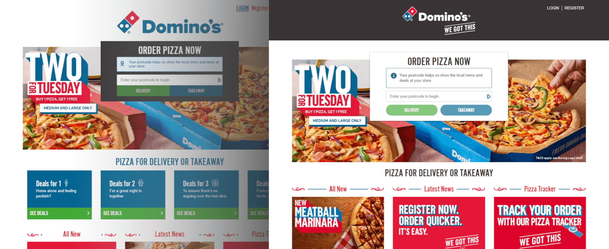
Just before the pandemic shifted us all into remote work, our team began planning a reskin project for Domino’s UK website.
A reskin is essentially a user interface (UI) refresh of the customer-facing side of a website.
The process looks something like this:
- Start with an existing, well-established website (in our case, about 8 years old).
- Work from a polished design vision provided by the creative team.
- Transition from the current look to the new one as smoothly as possible, without disrupting the customer experience or business performance.
This last point was especially important. Domino’s is one of the most popular pizza brands in the UK, and even subtle changes in the UI can influence customer behaviour. For example, something as simple as adjusting the style of a call-to-action button could reduce clicks. That’s why careful planning and incremental updates were crucial.
Having spent months in both planning and implementation, I can say with confidence that reskinning a legacy website is a complex undertaking.
Key Considerations
Several challenges shaped our approach:
- The project was a live system, with multiple development teams continuously adding features, backend logic, and UI updates.
- Some of the new designs required significant structural HTML changes.
- The codebase was based on older technologies and practices - layouts built with CSS tables, floats, and absolute positioning, with many fixed-width elements. Even small updates could cascade into widespread adjustments.
- UI components weren’t standardised, so the same element often appeared hundreds of times across the codebase. This meant even small changes could turn into time-consuming tasks.
One might ask: why not rebuild from scratch with modern technologies and practices? The answer lies in customer trust. For a brand with such a loyal customer base, dramatic visual changes can disrupt the user experience and even affect trust in the platform. The reskin served as a bridge between the old and the upcoming fully re-platformed website.
Our Approach
This was the first reskin of this scale for most of the team. Domino’s receives a very high volume of daily visitors, which made the work both challenging and rewarding.
We adopted a phased, incremental approach:
- A small team of one product owner, one designer, and two developers started the project, with QA joining later.
- The work was divided into five phases, each focusing on specific UI updates - such as colours, spacing, icons, or button styles.
- Incremental releases allowed us to gradually introduce changes, minimising disruption for customers.
Project Phases
Phase 1 – Testing the Ground
This phase focused on preparation and exploration. We checked the codebase, updated outdated NPM packages, and created a file structure for all upcoming phases.
For the customer-facing side, we introduced one small change: updating the primary and secondary colours. The change was intentionally minimal and went completely unnoticed by most visitors. That was fine - the main objective was to understand the legacy system and identify what to look out for in future stages.
Release date – 10/2020
Phase 2 – Brightening the Experience
Before this release, the website relied heavily on dark tones - grey navigation, black menu cards, and navy backgrounds.
In this phase, we significantly brightened the site:
- Navigation, cards, and backgrounds were lightened.
- Shadows were introduced for cards, helping them stand out from the background.
- Alignment and spacing issues were addressed across the site, giving elements more breathing space.
- Several PNG icons were replaced with vectors for sharper visuals.
From a user perspective, the change felt subtle, but on closer inspection, pages were noticeably cleaner, brighter, and more consistent. For the team, this was a big milestone - our first visible transformation of the site.
Release date – 02/2021
Phase 3 – Icon Overhaul
After Phase 2, we realised our planned phases were quite large. We discussed breaking them into smaller increments, but because many design elements were interdependent, it wasn’t practical.
Phase 3 focused on icons. Previously, the site used a mix of PNG sprites and Font Awesome. We consolidated these into a modern SVG system, which allowed for scalability and consistent quality.
We also introduced ribbon titles to certain pages, adding a touch of playfulness that tied nicely with printed marketing materials.
Release date – 03/2021
Phase 4 – Completing the Icon Work
This phase turned out to be the most difficult. We continued migrating icons to the new SVG system but also updated several global elements.
Key changes included:
- Sub-navigation updates on the menu and checkout pages.
- A new, darker header style.
Because these updates touched so many areas of the site, we encountered numerous unexpected issues. Still, the team stayed motivated, keeping spirits up with humour even as we worked through setbacks.
Release date – 04/2021
Phase 5 – Final Refinements
The last phase was all about polishing and consistency:
- Rounded buttons for a modern look.
- Cleaned-up dialogues and modals.
- Layout refinements across pages.
- Final designs for promotional cards.
- Navigation updates with a white background and clearer fulfilment and cart CTAs.
The knowledge that this was the final phase kept the team energised. That said, every time we spotted a missed UI element, we joked about an imaginary “Phase 6.”
Release date – 06/2021
Challenges and Lessons Learned
Legacy Code and Structure
The CSS and HTML were organised in a way that made incremental updates more complex. For example, the same styles were sometimes applied to unrelated components, and we often found duplicate templates with only minor variations.
To improve maintainability, we reorganised CSS using the BEM methodology, grouping component styles more logically. The project was already using SCSS, which made this transition smoother.
Still, due to the scope and timeline, we couldn’t fully refactor the HTML. Updating the same copy-pasted code across different areas became repetitive and time-consuming.
Lesson: Code organisation is best addressed early in a project. Following best practices from the start ensures scalability and reduces technical debt.
Source Control and QA Process
Initially, only two developers worked on the reskin, with QA joining later. By then, several phases were already underway, creating challenges with bug fixes overlapping active development.
The process looked like this:
- QA found a bug in Phase 2.
- We fixed it in Phase 2, then merged it into Phase 3 and Phase 4.
- Another bug was found, and the cycle repeated.
Because fixes overlapped with in-progress work, regressions often crept in. We frequently found ourselves redoing work we thought was complete. Phase 4, in particular, was challenging due to regressions and rework.
By contrast, Phase 5 - larger in scope - went much more smoothly, because QA was fully engaged alongside development. Bugs were caught early and resolved before becoming regressions.
Lesson 1: Engage the whole team - including QA - from day one. Parallel testing prevents regressions and saves significant time later.
Lesson 2: If resources are limited, structuring work into isolated sets of files or branches for each phase can help reduce conflicts.
Summary
Despite the challenges, the reskin project achieved its goal: creating a smoother bridge between the legacy Domino’s website and the upcoming re-platform.
The updated UI aligned more closely with modern design expectations while maintaining customer trust and engagement. The project also gave the team valuable experience in phased rollouts, legacy code management, and collaboration under constraints.
Most importantly, it set the stage for the next chapter: introducing Vue.js, Storybook, headless CMS, and microservices into the Domino’s platform.
Thank you for reading, and I look forward to sharing more insights in future articles.
Glossary of Terms
- UI (User Interface): The visual and interactive elements of a website or application that users engage with.
- CTA (Call-to-Action): A button or link designed to encourage a specific user action (e.g., “Order Now”).
- HTML (Hypertext Markup Language): The standard language used to structure content on the web.
- CSS (Cascading Style Sheets): A stylesheet language used to control the design, layout, and presentation of HTML elements.
- SCSS (Sassy CSS): A CSS preprocessor that adds features like variables and nesting for easier stylesheet management.
- BEM (Block, Element, Modifier): A methodology for naming and organising CSS classes in a consistent and scalable way.
- NPM (Node Package Manager): A tool used to manage JavaScript libraries and dependencies in a project.
- SVG (Scalable Vector Graphics): A file format for vector images that can scale to any size without losing quality.
- PNG (Portable Network Graphics): A raster image format commonly used for web graphics.
- Font Awesome: A popular library of pre-built icons.
- QA (Quality Assurance): The process of testing software to ensure it works correctly and meets requirements.
- Regression: A bug that reappears after previously being fixed, often caused by later changes in the codebase.
- Source Control: A system for managing changes to code (e.g., Git).
- Re-platforming: Rebuilding or migrating a website onto a modern technology stack while maintaining its functionality.