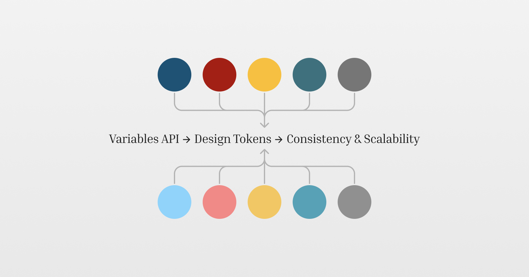
At Domino's, we strive for consistency and scalability when building UIs across web and mobile platforms. While we have always aimed for a unified design and development process, maintaining consistency in design variable names across projects has always been challenging. With the introduction of Figma's Variables API, we have addressed this issue by automating the fetching of Figma variables directly into our codebase, which enabled us to maintain consistency between design and UI implementation and, as a very nice bonus, support both light and dark modes seamlessly.
In this post, I will walk you through how we used Figma's API to automatically generate design tokens, improving our workflow by aligning design and development more closely.
The Problem We Had To Solve
The engineering goals at Domino's are ambitious, and we often partner with other companies to reach them. Which means things are always very dynamic. Developers change, different teams build different parts of the website, email templates, mobile apps and so on.
When developing UI, devs always ensure that no raw design values (like the HEX values of colours) are used across the code, following the “DRY” (Don't Repeat Yourself) principles to maintain clean code across all projects.
Developers achieve this by converting reusable design values into variables. Then, those variables can be used anywhere in the code, ensuring consistency in the codebase and produced UI.
Maintaining consistency between the naming conventions of those variables has been quite a challenge, though.
For instance, here is an example of one colour which is named differently across different projects:
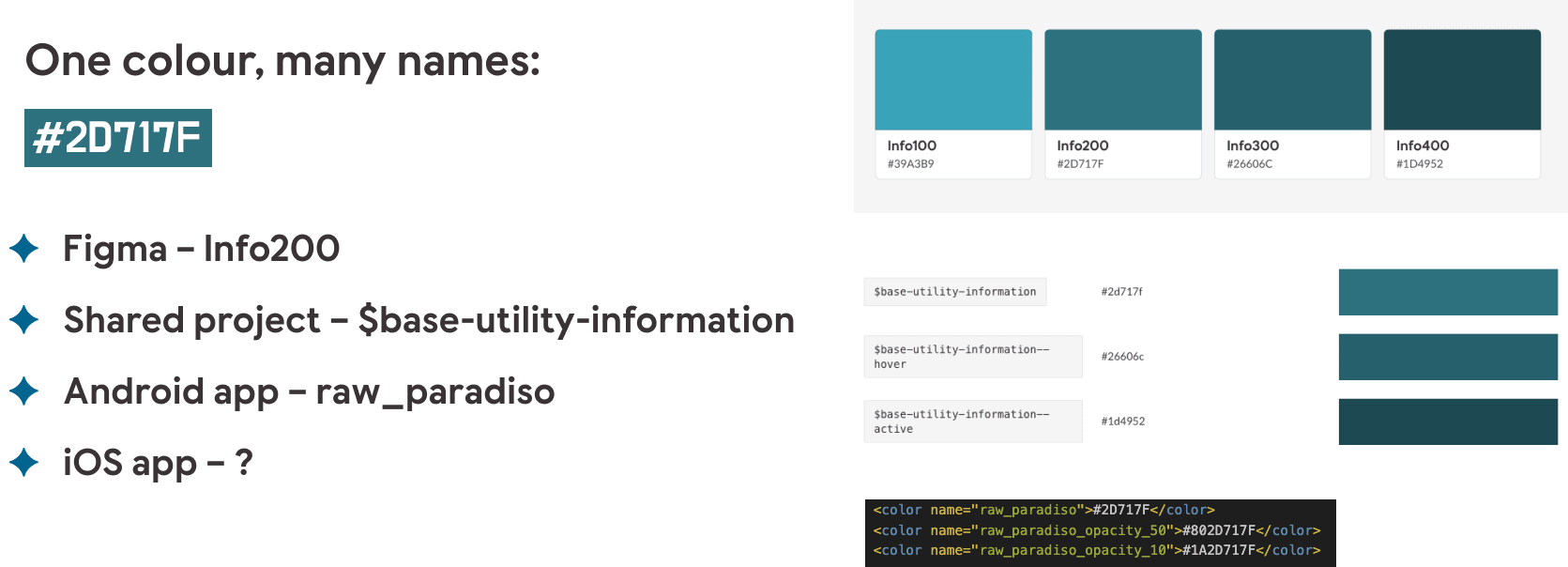
As I am sure you can already see, this is quite inneficient. This scenario becomes particularly problematic when scaling up and adding new projects. Adding new sets of design variables to new projects is neither ideal nor scalable.
Introducing Design Tokens
To address this issue, we decided to add Design Tokens as a Service to Domino's tech stack.
Design tokens are a centralised set of design values like colours, fonts, and shadows that are common across all projects. These values can be packaged into a single resource and shared across the organisation.
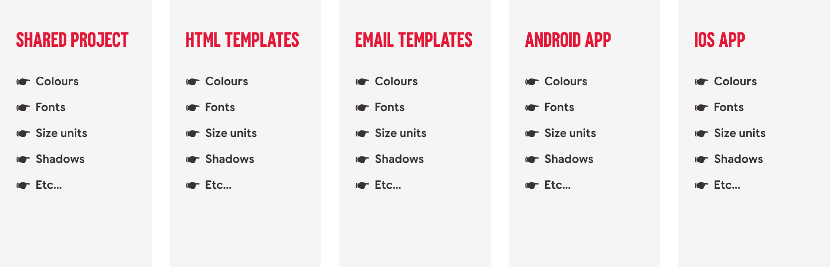
Essentially, design tokens allow you to go from this setup for multiple projects:
To this:
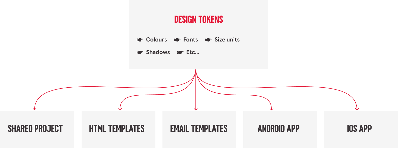
With design tokens, we can ensure consistency across all projects and simplify the process of maintaining design values. Any updates made in the design tokens package can be instantly reflected in the individual projects, ensuring that design and development stay in sync.
Leveraging Figma's Variables API
Design tokens can be achieved in a couple of ways. For example, some teams maintain files containing all design tokens in an easy-to-access location, and then these files are used as a single source of truth by everyone - devs and designers.
This approach is better than maintaining multiple sets of design values. However, it is still very manual - someone must update the files whenever changes are introduced.
To support scalability, we created an automated process that generates design tokens by pulling variables directly from Figma using the new Variables REST API.
Figma's Variables API provides direct access to the variables our designers create in Figma files, allowing us to automate the design token generation process.
Once the design tokens are generated, we publish them as an installable npm package, which we then use across multiple projects, ensuring consistency in the developed UI and naming conventions.
How Figma's Variables Simplify Theme Support
One of the most powerful features of Figma variables is their ability to support multiple modes, such as light and dark themes. In Figma, you can define a single variable, such as background-color, and assign it multiple values depending on the mode. For example:
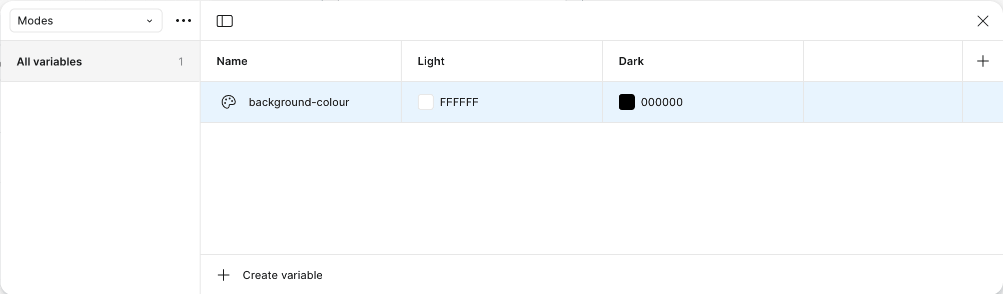
This view in Figma allows you to manage all variables in one location, ensuring that mode/theme-specific styles are consistent and easy to update.
A setup like this also simplifies the front-end implementation of themes. When Figma variables are fetched and converted into CSS variables, switching between light and dark modes becomes as simple as toggling between different sets of predefined tokens:
--background-colour: #ffffff- for light theme--background-colour: #000000- for dark theme
Figma's modes magic does not end with colour themes. You can apply similar principles to the sizing units, like container paddings, for example, which are often different for different screen sizes:
--container-padding: 12px- for mobiles--container-padding: 16px- for tablets--container-padding: 24px- for desktops
And instead of writing multiple media queries to apply different padding values to all affected elements, you can switch between CSS variables at the :root{} level:
:root {
  @media (max-width: 520px) {
    --container-padding: 12px;
  }

  @media (max-width: 768px) {
    --container-padding: 16px;
  }

  @media (min-width: 769px) {
    --container-padding: 24px;
  }
}

.container {
  padding: var(--container-padding);
}
Automating the Fetching of Design Tokens
Considering all the benefits this system could provide us with, convincing people to work on adopting the Design Tokens approach was not a difficult sell. All we needed was to actually do the work.
The approach we took consisted of two parts:
- Part 1 - UX designers had to create variables in Figma.
- Part 2 - The UI team had to find a way to fetch those variables from Figma and convert them to design tokens in the format needed.
For the UI part, we built a Node.js application. I'm not going to get into specific details of this application here (there will be a follow-up article with code examples), but here's how it works:
- Authentication and Setup: First, we set up Figma API access by generating a personal access token and obtaining the ID of the Figma file containing all variables.
- Fetching Data: Once authenticated, our Node.js script fetches the published variables data from Figma.
- Processing Data: The data is then processed, and we generate separate files for different token collections (e.g., Core colour tokens and Light/Dark mode tokens).
- Generating CSS Variables: Finally, we generate design tokens as CSS variables for our web projects and group them into SCSS mixins for easier imports. For example, we might generate tokens like this:
/* Tokens for light mode - CSS variables */
@mixin modes--light--css-vars {
  --text-primary: rgba(57, 51, 54, 1);
  --text-secondary: rgba(84, 84, 84, 1);
  --text-black: rgba(57, 51, 54, 1);
  --text-brand-blue-default: rgba(0, 100, 145, 1);
  --text-brand-blue-bold: rgba(0, 100, 145, 1);
  --text-brand-blue-bolder: rgba(0, 100, 145, 1);
  --text-white: rgba(255, 255, 255, 1);
  ...
}

/* Tokens for dark mode - CSS variables */
@mixin modes--dark--css-vars {
  --text-primary: rgba(245, 245, 245, 1);
  --text-secondary: rgba(245, 245, 245, 1);
  --text-black: rgba(57, 51, 54, 1);
  --text-brand-blue-default: rgba(0, 100, 145, 1);
  --text-brand-blue-bold: rgba(24, 147, 204, 1);
  --text-brand-blue-bolder: rgba(245, 245, 245, 1);
  --text-white: rgba(255, 255, 255, 1);
  ...
}
And add them to the :root {} like this:
@import "design-tokens/collection-modes--light--css-vars.scss";
@import "design-tokens/collection-modes--dark--css-vars.scss";

:root {
  @include modes--light--css-vars;

  @media (prefers-color-scheme: dark) {
    @include modes--dark--css-vars;
  }
}
This makes the CSS variables accessible across all pages of our application. They can be easily integrated into the front-end code, enabling smooth toggling between light and dark modes based on user preferences.
Showcase: Adding Light and Dark Themes To Our Button Component
To illustrate the impact of our new system, let's look at how it improved our button component.
Before implementing design tokens, our UI library only supported the light theme, and adding a dark one was going to be a time-consuming process, mainly because of how our variables were named.
For all the colour variables in our system, we used generic naming conventions which were not specific enough to allow for easy theme switching.
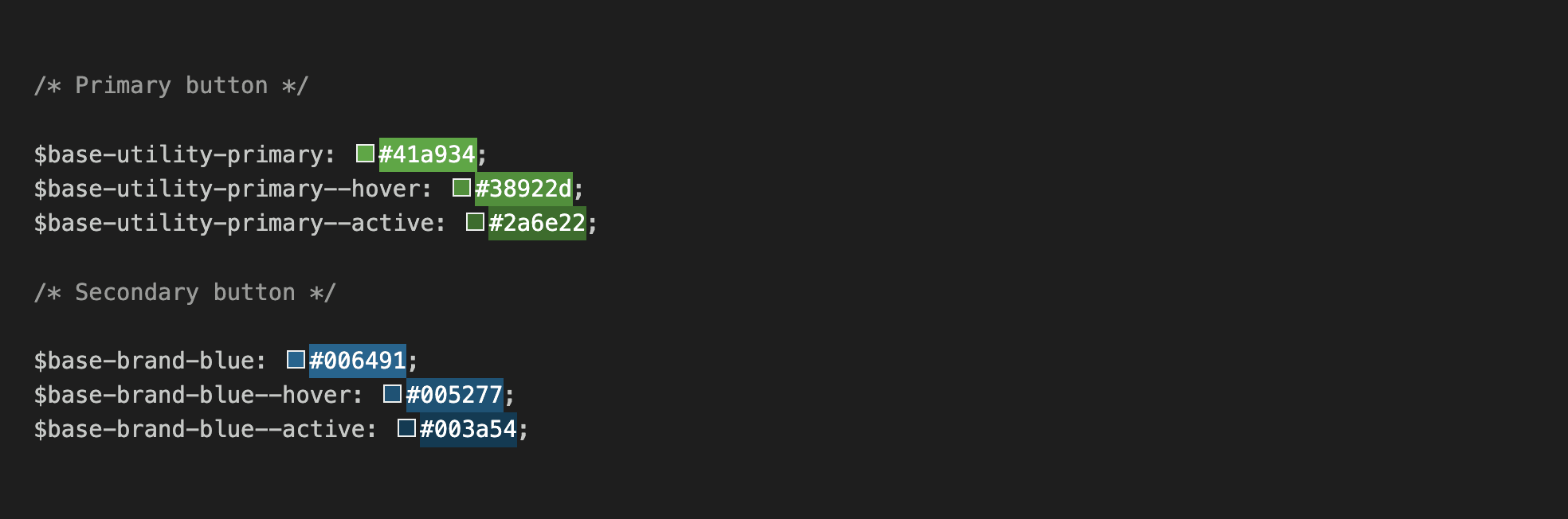
For example, $base-utility-primary was used in all the components that needed that shade of green colour, and changing the value of this variable would have affected many elements in our UI library.
This was neither right nor wrong; it was just the way things were done when designs were initially created for our UI components library.
With Figma variables in place, UX designers are much more specific when defining colour names. Here, you can see variables created specifically for the button component:
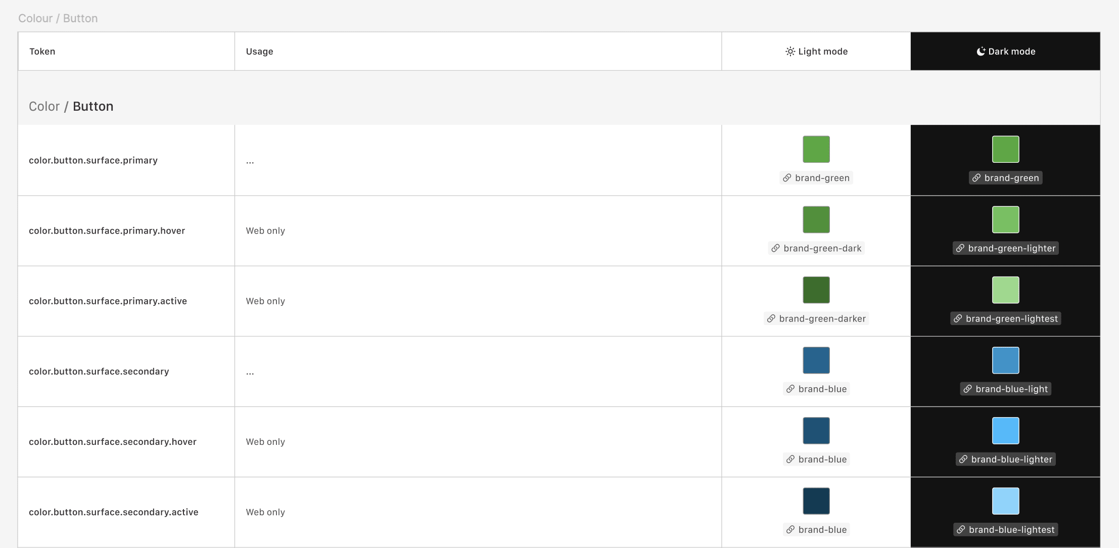
These variable names are much easier to read and understand, and the use intent is very obvious to anyone.
When we fetch these same variables from Figma into our Design Tokens system, they look like this:
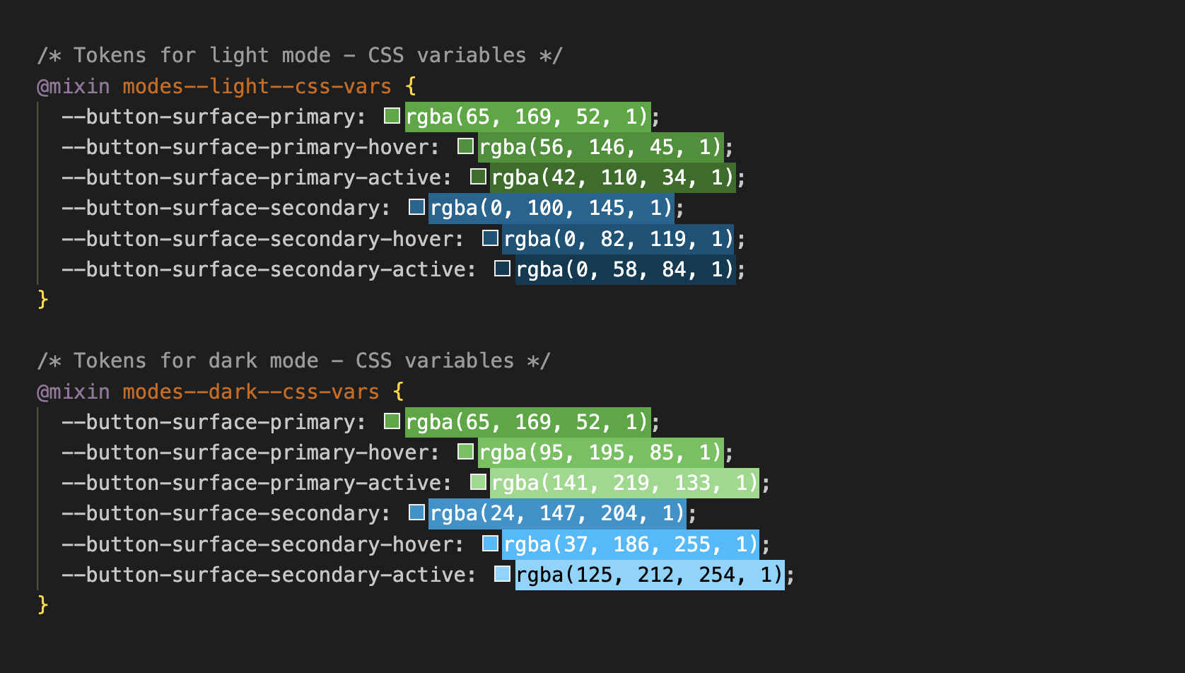
As you can see, the variables are grouped into light and dark mode SCSS mixins, which, when imported gloablly, really simplifies the CSS code for the actual buttons:
.button-primary {
  background-color: var(--button-surface-primary);

  &:hover {
    background-color: var(--button-surface-primary-hover);
  }

  &:active {
    background-color: var(--button-surface-primary-active);
  }
}
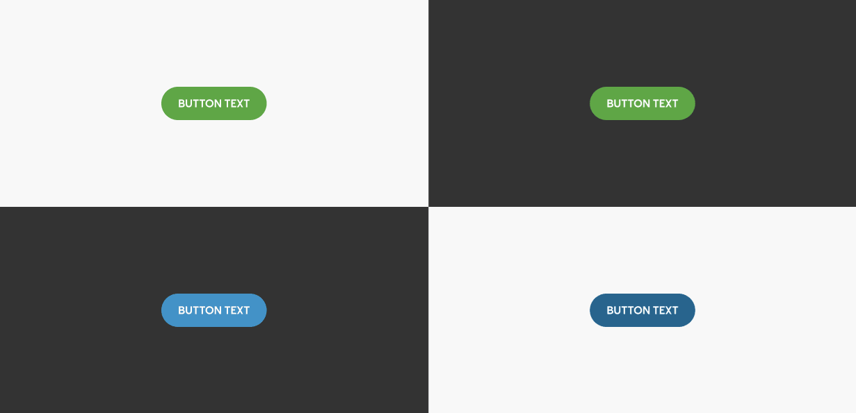
And this way we can easily support light and dark themes in our UI components:
When the design team updates the button colours in Figma, the changes are reflected in our UI library by just simply running the Node.js script. And once design tokens have been added to the remaining projects, this process will significantly reduce development time and ensure consistency.
The Road Ahead for Design Tokens at Domino's
We have made significant progress in integrating Figma's Variables into our development workflow; however, the project is still in progress.
Our goal is to fully implement design tokens across all projects, ensuring a unified, scalable approach to UI development. As we continue to refine our implementation, I am excited to see how this approach evolves and how it will shape the future of UI development at Domino's.
By staying focused on this ongoing work, I am confident our efforts will result in a more cohesive, efficient, and scalable design system for all of Domino's digital experiences.
Glossary of Terms
- Design Tokens: Centralised design values (like colours, fonts, sizes) that can be shared across projects.
- Figma: A collaborative interface design tool.
- Variables API: An API provided by Figma that allows access to design variables defined in Figma files.
- CSS Variables: Also known as CSS custom properties, these entities contain specific values to be reused throughout a document.
- SCSS: A preprocessor scripting language interpreted or compiled into Cascading Style Sheets (CSS).
- Node.js: An open-source, cross-platform JavaScript runtime environment.